Microsoft has decided to enable ClearType by default in Internet Explorer 7 (Beta 2), independent of whatever the user has selected as his/her OS setting. Its not clear if this will remain the case when they finally release IE 7, but the decision seems to have caused a bit of confusion.
For what its worth, I agree with Bill Hill about the value of good antialias text rendering. Some argue it just makes text blurry, and that it is strictly a benefit ONLY for visual appearance (i.e. it looks better, but is harder to read, AKA "form over function"). I don't agree, though I think that you indeed sacrifice letter quality to improve word quality, and therefore, increase readability.
We went through almost exactly the same thing with Boxely, inside AOL. For a variety of technology driven reasons (historical, patent-issues, alpha channel problems, etc.) we ended up with our own text display engine in Boxely - in which we do our own font rendering, at a pixel level. It is antialiased, always, regardless of OS setting, and the Boxely team caught a lot of flack for it, but it hasn't been a big deal in the real world.
I think it improves both the form and function of our OCP apps. Or maybe Bill and I just drank too much of the same cool-aid...
Still, it DOES kind of suck to not respect the OS setting. More and more it makes you wonder about the value of the no-longer-very-unified user experiences that modern GUIs were supposed to provide.
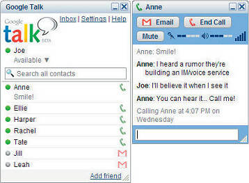
Just perusing the look and feel of the latest AIM Triton, MSN Messenger 8, Microsoft Office 12, Picasa 2, Adobe Lightroom, IE 7, Google Talk...
Hmm - so much for a consistent "look and feel"...
There's a trend here clearly - I think we're at a major inflection point with regard to user interfaces for applications that Vista will accelerate.
Part of the question is: Is this a good thing? Does it matter anymore?
I'm not sure it does - exposition forthcoming in part 2.
10 comments:
The Office 12 window has the same large titlebar icon like Boxely apps do!
pretty funny, hunh? imitation is the flattery...
Sree,
I think this is exactlly the thing that needs to be done. If the system can handle it we need to use it, even if not a default. I've owned my laptop for about 2 months and completely forgot about Cleartype, now that it is enabled my experience is a whole lot better, and that is what we are about right? Delivering the ultimate or best experience for the member.
Just my personal opinion.
Any application deciding to leverage Cleartype-like anti-aliasing should really respect the global setting of the user.
Flash 8 for example (well, their Saffron engine internally) will respect the global OS setting and use their Cleartype-alike only when Cleartype is enabled.
Cleartype on my CRT looks like poo on a stick... But looks great at home on my LCD.
Corey,
"Cleartype on my CRT looks like poo on a stick... But looks great at home on my LCD."
Of course...perhaps monitor detection could play a role in doing any "nonrespectful" actions?
corey, that's not strictly true (as in, its false :P) - Flash will indeed not do sub-pixel antialiasing if ClearType is not enabled, but it doesn't actually respect the users's choice, for example if they turn "font smoothing" off.
It will ALWAYS be antialiased.
We have gotten mostly positive feedback on the Triton UI, but after my blog post on Saturday about what makes for a beautiful UI, I have heard back from a few users who mentioned that we need to build a "skin" to make us look like we fit into the OS.
Personally, the uniform look of OS X is quite appealing if only because there are no surprises. Of course the bad news is, there are no surprises. There is little inovation and people thinking outside the box wrt the OS X UI.
greg - Yeah, that was part of the question, I guess: what does "OS" look mean when even Microsoft isn't providing "one" look?
I think its really the "older" (let's be nice and call them "tenured") folks who care - I think the Web and Games have taught hundreds of millions of people to deal with some BIG differences in visual appearance and function.
I think it *is* important that the core grammars of interaction remain, though.
I'm surprised you cite OS X as having a uniform look - did you mean the original white-on-white, brushed metal, wood paneling, or the new flat grey/blue?
They pop in new behaviour, locations, animations, etc. ALL the time. Its (usually) well done - but its RARELY consistent.
I think they (at least at the OS level) started the trend - just seems like the blind acolytes of their kooky religion don't notice ...
(that last part was a joke :))
"Flash will indeed not do sub-pixel antialiasing if ClearType is not enabled".
Right - thats what I thought I said. I don't mind that they still honor the movie's font smoothing hints independent of system setting, but don't use ClearType-ish smoothing (subpixel with varying colors used for antialiasing vs. monochromatic pixels).
I guess what I'm saying is classic antialiased text looks "ok" on crt or lcd. Cleartype approach is just wrong on some crt's so should not be used unless OS setting has it enabled.
Yeah - but I don't think that people care (or even notice) the sub-pixel fringing. They complain about "blurry" v. "not", not about color bleed
Post a Comment